Tailored Spaces: Web Design Solutions for Scopo Home and OVCR
Web Design

Tailored Spaces: Web Design Solutions for Scopo Home and OVCR
Web Design

Tailored Spaces: Web Design Solutions for Scopo Home and OVCR
Web Design
Scopo Home
Scopo Home
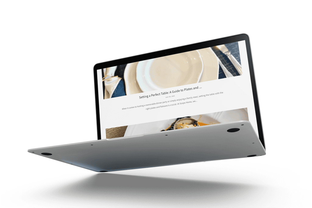
The Scopo Home Shopify website was crafted to reflect the brand’s mission of merging purpose with quality. The design emphasizes a clean, modern aesthetic that highlights Scopo’s premium restaurant-quality serveware. User-friendly navigation guides visitors through an elegant online shopping experience, where they can explore durable, stylish flatware and plateware designed by Scopo’s team in Chicago. The site showcases Scopo’s commitment to exceptional craftsmanship, making it easy for customers to find products that elevate their everyday and special occasion dining experiences.
The Scopo Home Shopify website was crafted to reflect the brand’s mission of merging purpose with quality. The design emphasizes a clean, modern aesthetic that highlights Scopo’s premium restaurant-quality serveware. User-friendly navigation guides visitors through an elegant online shopping experience, where they can explore durable, stylish flatware and plateware designed by Scopo’s team in Chicago. The site showcases Scopo’s commitment to exceptional craftsmanship, making it easy for customers to find products that elevate their everyday and special occasion dining experiences.
Keywords:
Clean, modern aesthetic
Premium serveware
User-friendly navigation
Elegant shopping experience
Exceptional craftsmanship
Restaurant-quality flatware and plateware
Chicago-based design
Durable and stylish products
Elevated dining experiences
Purpose and quality-driven brand
Keywords:
Clean, modern aesthetic
Premium serveware
User-friendly navigation
Elegant shopping experience
Exceptional craftsmanship
Restaurant-quality flatware and plateware
Chicago-based design
Durable and stylish products
Elevated dining experiences
Purpose and quality-driven brand


1- Simplicity: Keep the design clean and minimal to allow the product quality to shine. Avoid clutter, and focus on creating a streamlined shopping experience.
2- Visual Hierarchy: Highlight premium serveware with large, high-quality images. Use contrast and typography to draw attention to key product details and features.
3- Consistency: Maintain a cohesive color palette and typography that reflects Scopo’s modern, elegant branding throughout the site.
4- Usability: Ensure user-friendly navigation and clear calls to action, making it easy for visitors to browse, explore, and purchase products.
5- Responsiveness: Optimize the site for various devices to ensure a seamless shopping experience across desktops, tablets, and smartphones.
6- Emphasis on Craftsmanship: Incorporate product descriptions, images, and design elements that underscore Scopo’s dedication to quality and exceptional craftsmanship.
7- Brand Storytelling: Use strategic content placement to communicate Scopo’s mission of merging purpose with quality, creating a deeper connection with the audience.
8- Engagement: Include interactive elements like product filters, quick views, and customer reviews to enhance user engagement and trust.


OVCR Website Design
OVCR Website Design
OVCR (Office of the Vice Chancellor for Research) is an integral part of your organization, responsible for overseeing and promoting research initiatives. The website redesign for OVCR aimed to enhance the digital presence of the office, making it more accessible, informative, and engaging for its diverse audience.
OVCR (Office of the Vice Chancellor for Research) is an integral part of your organization, responsible for overseeing and promoting research initiatives. The website redesign for OVCR aimed to enhance the digital presence of the office, making it more accessible, informative, and engaging for its diverse audience.
Keywords:
Research initiatives
Accessibility
Informative content
Engaging user experience
Digital presence enhancement
Diverse audience
Research support
Clear navigation
Academic and research community
Institutional impact
Keywords:
Research initiatives
Accessibility
Informative content
Engaging user experience
Digital presence enhancement
Diverse audience
Research support
Clear navigation
Academic and research community
Institutional impact


1- Accessibility: Prioritize inclusive design by ensuring the site meets ADA compliance standards, with readable text, alt text for images, and keyboard navigation for all users.
2- Clarity: Use a well-organized structure and intuitive navigation to make important information easily discoverable for researchers, faculty, and stakeholders.
3- Engagement: Design with interactive features, such as research highlights, case studies, and event updates, to keep users informed and engaged with OVCR's latest initiatives.
4- Content Hierarchy: Emphasize important sections like funding opportunities, policies, and research resources using clear headings, bold typography, and strategically placed call-to-action buttons.
5- Professional Aesthetic: Reflect the academic and institutional nature of OVCR with a clean, professional design, using muted colors and sharp typography that convey credibility and authority.
6- Responsiveness: Ensure the site adapts seamlessly across all devices to provide a smooth browsing experience for both desktop and mobile users.
7- Transparency: Provide clear and concise information on research policies, funding, and opportunities, using an easy-to-navigate structure for visitors to find relevant content quickly.
8- Impactful Imagery: Incorporate visuals that highlight research achievements and the positive impact of OVCR on the academic and research community.


