Barista: Where Flavor Meets Artistry
Logo Design

Barista: Where Flavor Meets Artistry
Logo Design


Barista is a contemporary restaurant that emphasizes a fresh and organic dining experience. The client wanted a logo that would reflect their commitment to sustainability and healthy living, with green as the primary theme. My goal was to create a visual identity that captured the essence of Barista's brand—fresh, modern, and inviting.
Barista is a contemporary restaurant that emphasizes a fresh and organic dining experience. The client wanted a logo that would reflect their commitment to sustainability and healthy living, with green as the primary theme. My goal was to create a visual identity that captured the essence of Barista's brand—fresh, modern, and inviting.


Barista is a contemporary restaurant that emphasizes a fresh and organic dining experience. The client wanted a logo that would reflect their commitment to sustainability and healthy living, with green as the primary theme. My goal was to create a visual identity that captured the essence of Barista's brand—fresh, modern, and inviting.
Barista is a contemporary restaurant that emphasizes a fresh and organic dining experience. The client wanted a logo that would reflect their commitment to sustainability and healthy living, with green as the primary theme. My goal was to create a visual identity that captured the essence of Barista's brand—fresh, modern, and inviting.


Client Discovery
Client Discovery
The project began with a detailed consultation to understand Barista’s brand values, target audience, and visual preferences. The client emphasized the importance of incorporating green elements to symbolize freshness and a natural feel, aligning with their focus on healthy, sustainable dining.
The project began with a detailed consultation to understand Barista’s brand values, target audience, and visual preferences. The client emphasized the importance of incorporating green elements to symbolize freshness and a natural feel, aligning with their focus on healthy, sustainable dining.


Research & Inspiration
Research & Inspiration
I conducted market research to analyze competitor logos and identify design trends in the restaurant industry. This helped me conceptualize a unique identity for Barista that would stand out while aligning with contemporary visual aesthetics.
I conducted market research to analyze competitor logos and identify design trends in the restaurant industry. This helped me conceptualize a unique identity for Barista that would stand out while aligning with contemporary visual aesthetics.


Concept Development
Concept Development
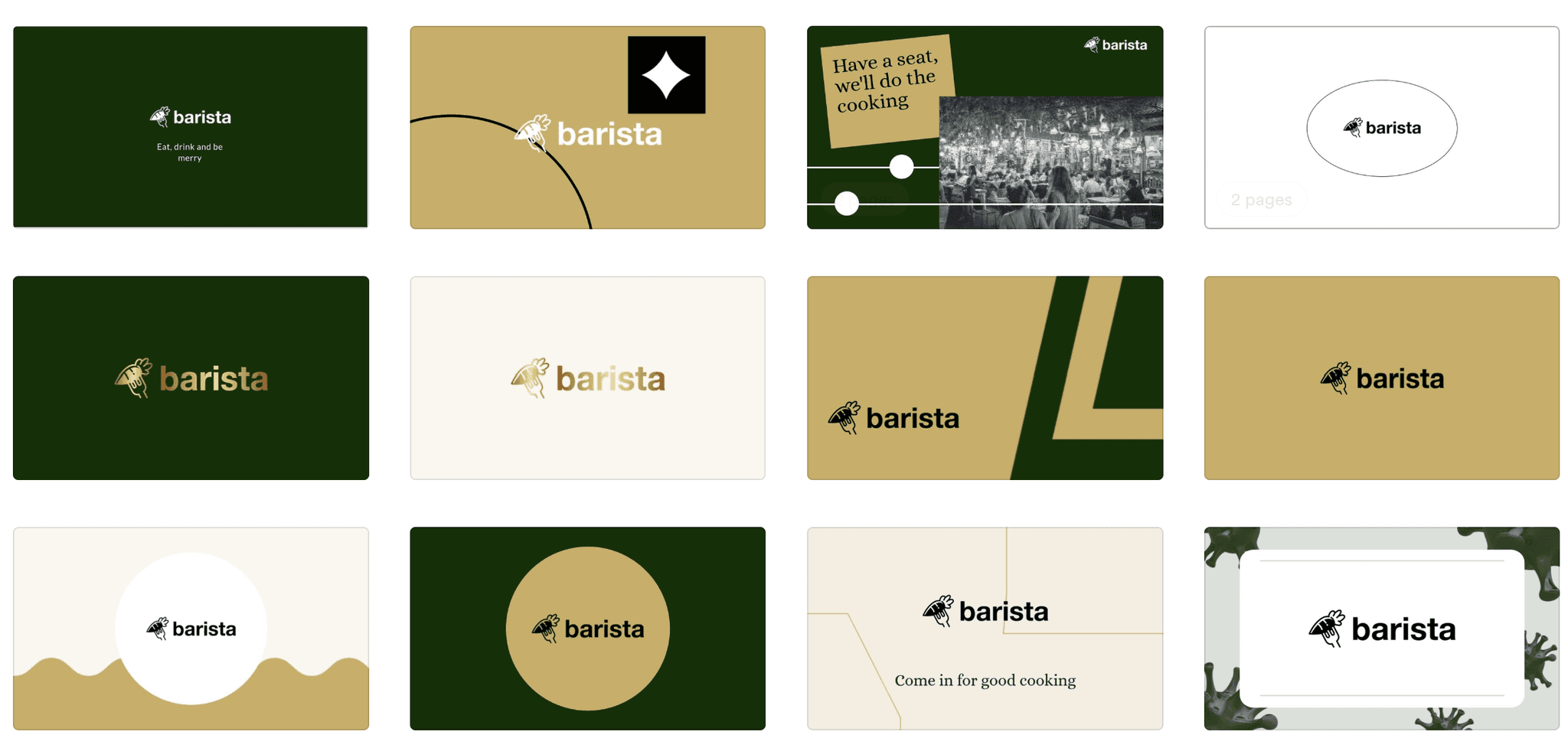
Based on the research insights, I developed several initial logo concepts, each incorporating green in various ways. I explored different styles, including minimalist line art, organic shapes, and playful typography, to capture the vibrant and welcoming atmosphere of Barista.
Based on the research insights, I developed several initial logo concepts, each incorporating green in various ways. I explored different styles, including minimalist line art, organic shapes, and playful typography, to capture the vibrant and welcoming atmosphere of Barista.


Design Refinement
Design Refinement
After presenting the initial concepts to the client, we collaborated on refining the preferred design. I adjusted the typography, fine-tuned the color palette to various shades of green, and enhanced the logo's overall balance and readability.
After presenting the initial concepts to the client, we collaborated on refining the preferred design. I adjusted the typography, fine-tuned the color palette to various shades of green, and enhanced the logo's overall balance and readability.


