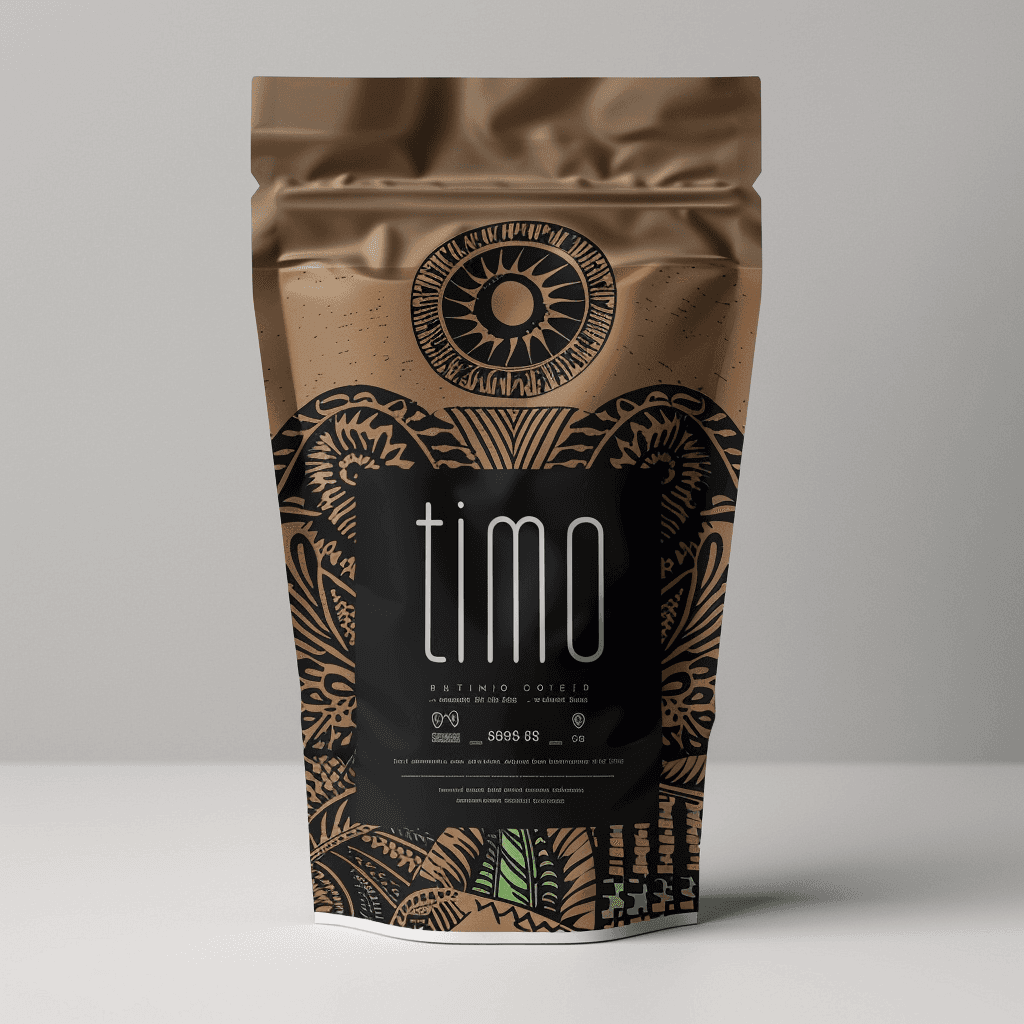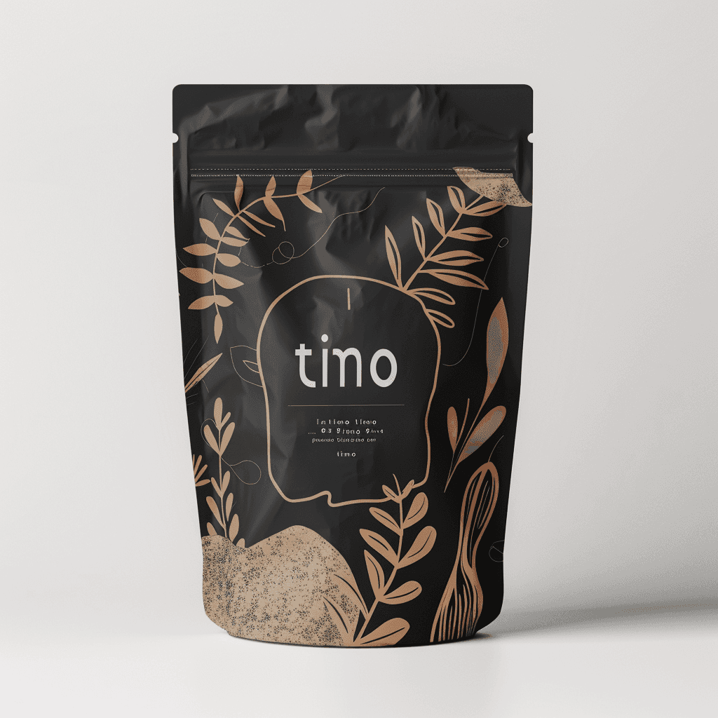
Timo Coffee: A Journey in Every Sip
Packaging Design

Timo Coffee: A Journey in Every Sip
Packaging Design


My vision for the coffee packaging design is a blend of modern minimalism and rich cultural storytelling. I aim to create packaging that feels fresh, inviting, and premium while maintaining an authentic, earthy connection to the coffee’s origin.
My vision for the coffee packaging design is a blend of modern minimalism and rich cultural storytelling. I aim to create packaging that feels fresh, inviting, and premium while maintaining an authentic, earthy connection to the coffee’s origin.


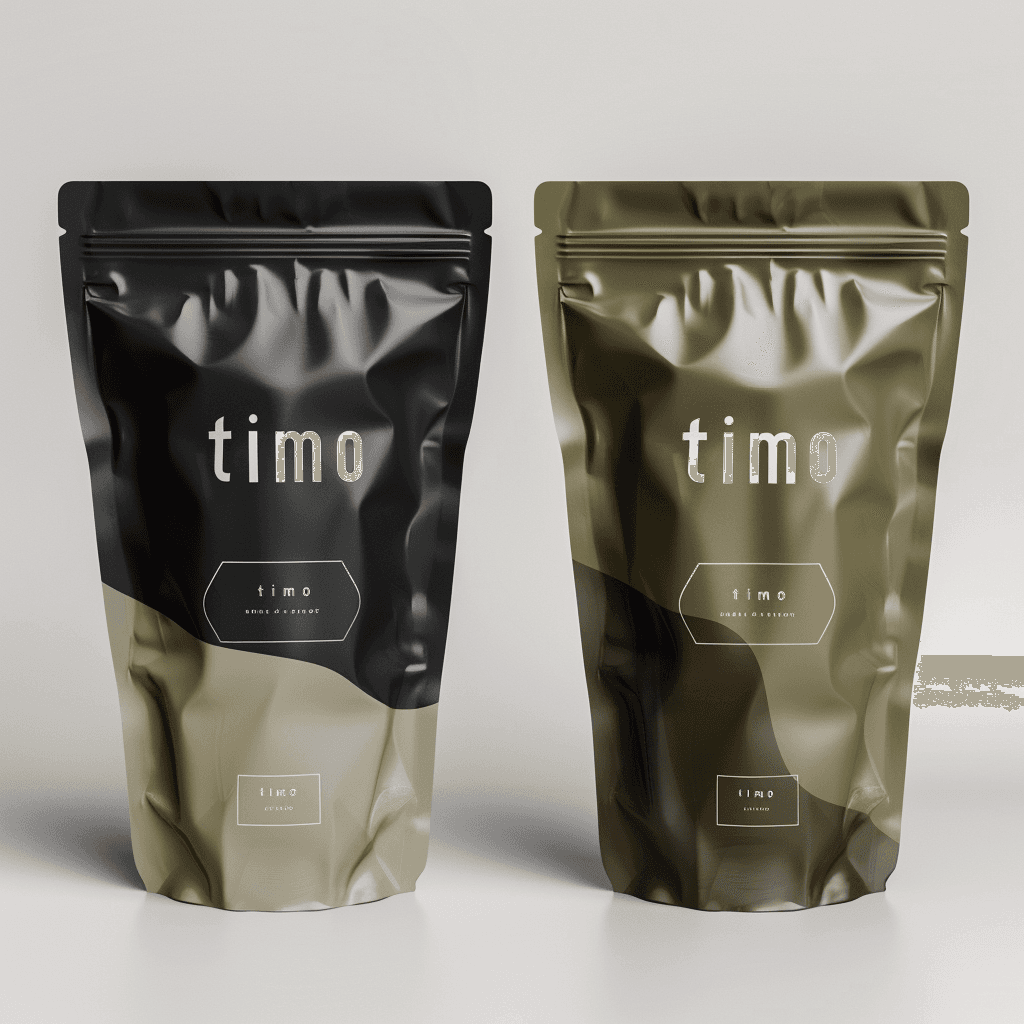


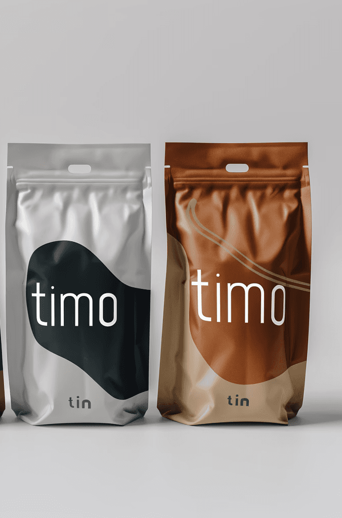
For my coffee packaging design project, I set out to create a visual experience that reflects both the modern coffee culture and the rich stories behind each blend. Imagine walking into a coffee shop, your eyes drawn to a sleek, minimalist package that feels both fresh and familiar. The clean lines and bold typography immediately convey a sense of sophistication, while the earthy tones and natural colors hint at the deep, robust flavor inside.
For my coffee packaging design project, I set out to create a visual experience that reflects both the modern coffee culture and the rich stories behind each blend. Imagine walking into a coffee shop, your eyes drawn to a sleek, minimalist package that feels both fresh and familiar. The clean lines and bold typography immediately convey a sense of sophistication, while the earthy tones and natural colors hint at the deep, robust flavor inside.
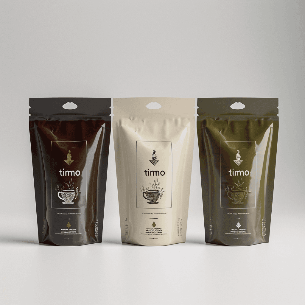


But there’s more to this design than just aesthetics. Each package carries a subtle, handcrafted touch—whether it’s a pattern inspired by the coffee’s region of origin or an illustration that brings its story to life. The goal was to make each bag feel like a journey, not just to the consumer, but to the coffee’s roots—honoring the farmers, the process, and the unique flavors from around the world.
But there’s more to this design than just aesthetics. Each package carries a subtle, handcrafted touch—whether it’s a pattern inspired by the coffee’s region of origin or an illustration that brings its story to life. The goal was to make each bag feel like a journey, not just to the consumer, but to the coffee’s roots—honoring the farmers, the process, and the unique flavors from around the world.


In this project, I focused on balancing simplicity with cultural richness, creating a design that stands out on the shelf while also inviting people to appreciate the craftsmanship behind their morning cup. This packaging doesn’t just protect the coffee; it celebrates it.
In this project, I focused on balancing simplicity with cultural richness, creating a design that stands out on the shelf while also inviting people to appreciate the craftsmanship behind their morning cup. This packaging doesn’t just protect the coffee; it celebrates it.


Key Words
Modern Minimalism
Premium
Earthy
Authentic
Storytelling
Clean Lines
Bold Typography
Natural Tones
Cultural Inspiration
Craftsmanship
Visual Depth
Sophistication
Modern Minimalism
Premium
Earthy
Authentic
Storytelling
Clean Lines
Bold Typography
Natural Tones
Cultural Inspiration
Craftsmanship
Visual Depth
Sophistication
1- Simplicity: Embrace a minimalist approach with clean lines and a streamlined layout to highlight the premium quality of the coffee.
2- Color Harmony: Use a balanced color palette of natural and earthy tones to reflect the coffee’s origin and create a cohesive look.
1- Simplicity: Embrace a minimalist approach with clean lines and a streamlined layout to highlight the premium quality of the coffee.
2- Color Harmony: Use a balanced color palette of natural and earthy tones to reflect the coffee’s origin and create a cohesive look.


3- Typography: Incorporate bold, clear typography to enhance readability and convey sophistication.
4- Illustration and Patterns: Integrate subtle, region-inspired illustrations or patterns to add depth and narrative, connecting the consumer to the coffee’s story.
3- Typography: Incorporate bold, clear typography to enhance readability and convey sophistication.
4- Illustration and Patterns: Integrate subtle, region-inspired illustrations or patterns to add depth and narrative, connecting the consumer to the coffee’s story.


5- Authenticity: Ensure the design reflects the true essence of the coffee, honoring its origins and the craftsmanship involved in its production.
6- Visual Appeal: Aim for a design that stands out on the shelf while also inviting consumers to explore the story behind the product.
7- Functionality: Design with practicality in mind, ensuring that the packaging is not only visually appealing but also functional for storage and use.


